
TL;DR
A successful logo is simple enough that it is easily identified and recalled. It is devoid of clutter, cliches, and fads that "date" its design.
A logo should be flexible enough to remain effective in a variety of scales and formats without losing quality or the integrity of its intended message.
A successful logo is based on the interests and needs of the audience with which it must connect. It must be appropriately and consistently applied as a small part of a larger brand experience that builds rapport and trust with consumers.
Logos are everywhere. As I write this post, I can count at least a dozen of them situated around the room on various devices and products. Naturally, when you start a business, one of the initial excitements is having a logo developed to set you apart from everyone else. But, what makes a great logo? To understand the elements that help make a logo successful, we must first understand what a logo is, and what a logo is not.
What is a logo?
If we grab the first bit of information available to us from a quick Google search, a logo is defined as a symbol or other design adopted by an organization to identify its products. While there are certainly ways to expand on this definition, this is exactly what a logo is at its most basic level - an identifier. A logo helps you, the consumer, quickly and clearly identify a product or service. It is important to also understand that a logo, itself, does not sell products. It is a small part of a larger brand identity and experience; a cog in a larger machine that, cumulatively, attracts or repels the consumer. Now that we understand the purpose of a logo - to identify - let’s dive into what makes a logo great?
3 Elements of a Successful Logo
1. Simplicity
The “KISS” (Keep it Simple Stupid) principle was pioneered by the US Navy in the 1960’s as a way to reinforce the idea that larger systems work best when they are designed to be simple. In this regard, the principle also applies to logo design. Because a logo is an identifier for your brand, it needs to be simple and easily recognized across different mediums. This means that, in order to be successful, a logo should be legible, uncluttered, and impactful. Because a logo is used in many different ways and formats, extremely small details will likely disappear when applied to small format mediums. Ultimately, you do not want consumers spending time trying to figure out what is going on with your logo.
Also, to be considered, is how well the logo works in a single color. If your logo is completely dependent upon color to drive home its concept and meaning, you will lose its impact when it is printed in black and white. A great logo works well at its most basic form.
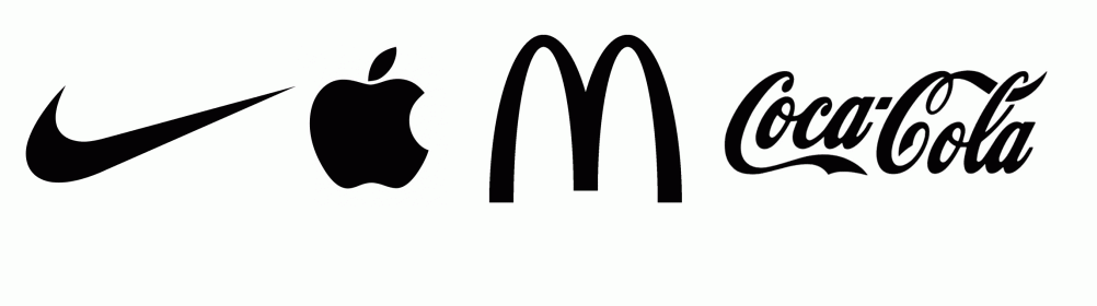
A logo should also avoid cliches and current “fads” so that your logo does not become dated. Think of the most obvious examples; Nike, McDonalds, Apple, Coca-cola. Without knowledge of these brands, and their beginnings, it would be nearly impossible to pinpoint the era for which their logo marks were created. They feel timeless, effortless, and void of cliches. This is especially true for a small business just getting started. A logo tells the consumer how they should feel about you, whether they should trust you or not. While the brand experience as a whole will ultimately determine that aspect, a logo that feels as though it has existed for decades, has some history, and could perhaps be a brand my grandfather once trusted, goes a long way to build relationships.
Ultimately, you want your logo to be unique, but also simple enough that it is easy to recall. A great test of this principle is to request a few close friends have a look at your current logo for 30 seconds or less. Then have them recreate your logo using pencil and paper. Alternatively, you could have them verbally describe to you the elements that make up your logo. If they’ve done this with some degree of success, it should be a sign that your logo is on the right path.
2. Balance & Flexibility
When considering your final design, it is important to consider all of the ways in which your logo *could* be used in the future. Sure, right now you only need it to work for your business card, but what are the possibilities for the future, after your business is established and experiences significant growth? Will your new logo work on stationery, emblazoned across the chest of a hoodie, on the breast of a polo, large scale for shop signage, or a billboard? What about swag, like pencils, keychains, pens, hats, etc.? What about a limited color palette, like a local newspaper that runs ads in black ink only? The best logos communicate well across each of these formats without loss of integrity.
Ideally, if your logo involves more than one element, you want it to be flexible enough that its elements can be separated from one another for individual use but also work to compliment one another when used together. Often times logos are created in, what is called, a lockup. these lockup’s typically include a graphic element and a typographic element that work together as a single unit. How these lockup's are crafted will impact the flexibility and balance of the logo itself.
Some elements that you want to consider, when looking to strike a balance are:
line thickness in relation to stroke and font weights
how the lockup will present on social media as a square or round avatar?
What parts of the design remain legible as it is scaled to the size of a thumbnail?
Some designers take things a step further and design logos using the Golden ratio. This ratio serves as a guideline for proportions and ensures every element of a design is well balanced.
3. Connecting with an Audience
Imagine your logo has a voice; what does it sound like? Who does it speak to? Consider Play-Doh as an example. Its logo is fun, playful, and evokes feelings of childhood and youthfulness. Now consider the Play-doh logo in a buttoned-up, more serious font-treatment, such as Times New Roman, or Futura. The would result would be a total disconnect between the brand, and its audience.
This concept can be very difficult as a new business owner as you have no baseline, necessarily, for consumer interests. It may be challenging to separate your own personal likes and dislikes from that of the intended market. In these cases, it is important to develop some form of an empathy graph. This process requires you to empathize with your intended audience; what do they dress like? What brands do they follow? What music do they listen to? Where do they hang out? The answers to these questions, among others, will help you better determine the direction in which the logo should head.
In addition to empathy graphs, market research is extremely important. Without it, your empathy graph will be worthless as it will likely be misguided. 30 years ago, market research meant a lot of footwork, phone calls, focus groups, and dollars. Today, however, it can be as simple as running an ad on Facebook, or Instagram, and Taking time to decipher meaning from post engagement. While that certainly isn't the be-all, end-all, it is an example of how easy it can be to gather fairly accurate information about large groups of individuals. This will take a lot of the guesswork out of the process as you attempt to steer your new business in the right direction.
Wrap-up
Logo design is important. It's often times very personal. Hiring a professional to assist you through the process can be extremely helpful; especially in separating emotional attachments from best practices for your new brand or business. That said, any designer you decide to work with should be able to produce examples of logo design they have completed that reflect the principles outlined above. Keep it simple, flexible, future-proof, and appropriate for the audience and you'll likely come out on top.
If if you're here because you need a logo, feel free to contact us as we would love to work with you through the process.